"The core problem with Teen Titans is that it’s never been about teenagers, but rather what adult writers want teenagers to be. Superboy, Robin, Wonder Girl, Kid Flash – these kids revere their elders and try to emulate them. Fuck that noise. Adults don’t deserve reverence. Plus, teenagers don’t want to read about obedient, law-abiding teens, and adults reliving their youth don’t want to read about obedient, law-abiding teens. They both want sex, drugs, and rock n’ roll (or substitute in hip hop). The Titans shouldn’t be fighting crime, they should be fighting for the right to party, and generally reminding adults how much they suck."
-- The Hooded Utilitarian
Sunday, June 26, 2011
Friday, June 03, 2011
Making the Final Battle photo
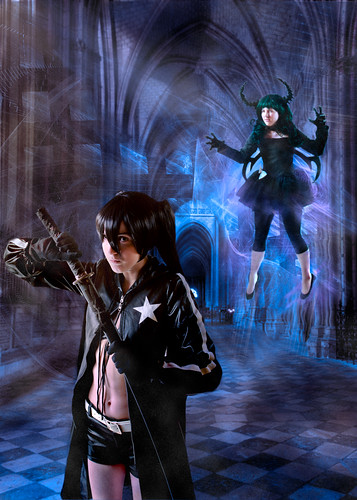
This was a cosplay photo based on the anime Black Rock Shooter.
For this photo I planned a lot out in advance. I asked the models to send me some example photos of the costumes so I could start thinking about what I wanted to do before the shoot. I realized that there wasn't any location available that would be right, so I planned from the start to do this as a composite photo, and we shot these indoors against a plain white background.
Kori was cosplaying as Dark Master (upper right), and I had her do some shots where she jumped up in the air and turned 180 degrees, then landed facing the opposite direction. With jumping shots, if I don't want it to look like jumping I'll often do something like this, or have the person jump sideways or backwards. Doing that takes away a lot of the characteristic body language of jumping and makes the pose a little harder to figure out.
So this was Kori's shot:


As soon as I saw this, I knew I could base a whole scene around this pose, because it looks like she is levitating, the pointed toes are great, and she has a wonderfully intense facial expression.
The shot of Emily as Black Rock Shooter that I ultimately used was this one:


I love her facial expression here, it is perfect for the character and the scene. She looks like she is completely ready to fight, but wishes she didn't have to.
Prior to the shoot I had done some research to try to find background photos. If I'd had access to a suitable location I would have tried to take a background photo myself, but I couldn't find anything like this. So I searched for Creative Commons photos of a cathedral, and I was especially looking for one that would have the black and white checkerboard pattern that is a visual motif in Black Rock Shooter. I found a great photo taken by Kent Landerholm. The original photo is this:
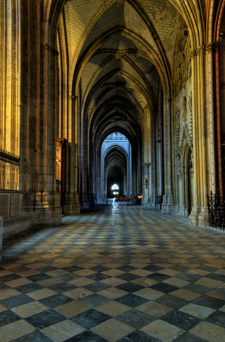
This is a wonderful HDR photo and it was just what I was looking for.
After the shoot, I started to think about how to lay out the composition. Here is one of my rough sketches for it:

You can see from this sketch that I'm still not sure what to do at this point. I'm trying out various positions. The circles and lines are a way of thinking about how the lighting might look, but I wound up doing something very different. The note "7 or 8" in this sketch was me trying to decide which photo of Emily to use.
I decided to mirror-image Kori and make a diagonal from lower left to upper right instead, because this sketch didn't feel right. But it helped me decide on a composition before I wasted a lot of time in Photoshop.
Once I decided on the layout, I put the elements together into a scene, and added in a "special effects" fractal that I had made in Oxidizer. I wanted the fractal image to be very high resolution, to actually be larger than the scene, so this took something like 2 hours to render on my laptop.
When I first put the elements into one image, that is when I had to make a decision whether to go ahead or bail out, because at this stage of the project it always looks pretty bad, nothing is blended yet, the colors are wrong, so I had to see some potential in it. In this case I thought I was on the right track.
The background photo is very wide-angle, with some spatial distortion because of that. Instead of trying to hide that, I actually increased it slightly by warping the background to make it "spill out" slightly more to the lower left. The Kori and Emily photos are taken from 2 different angles, so when put together they do kind of match the wide angle perspective of the background.
The colors in the original background photo are very yellow, and at first I tried to work with that, but it didn't work. My next approach was to desaturate the background to make it almost black-and-white, but that didn't feel right either. I decided on blue and purple for the main colors.
A lot of the work after that was painting in the new colors and the new lighting. I didn't use any Photoshop "Render Lighting" stuff here, it was all by hand. I also painted in some manga-style "speed lines" and added some "atmospheric heat distortion" to the area around Kori. I originally planned to do that with the ripple filter, but it didn't look right, so I ended up using the Liquify tool instead and putting in the distortion by hand.
When I got that figured out, I still felt it looked too "plastic." I decided to make it look like there was dust in the air, like in a very old building. So I started painting in "dust" layers, and this made it look a lot more like what I wanted.
One of my friends gave me a helpful critique of the rough draft of this piece, and based on his advice I added a bit of "distance blur" and increased the light and effects at the upper right to balance out the light at the lower left.
And that's about it. It was a lot of work, but in the end I got a scene that matched what I had imagined. All of this was inspired by the models Kori and Emily, I put in a lot of time on this because they gave me such great material to work with.
Subscribe to:
Posts (Atom)