Monday, October 21, 2013

Dundee Hills

Oregon Wine Country
Yesterday we went out to the Dundee Hills, one of my favorite Oregon wine-growing regions. The valley was full of fog, as seen in the background of this photo, but up in the hills it was sunny, and Mt. Hood was visible in the distance. This is the view from White Rose Estate.

Camera Roll-783
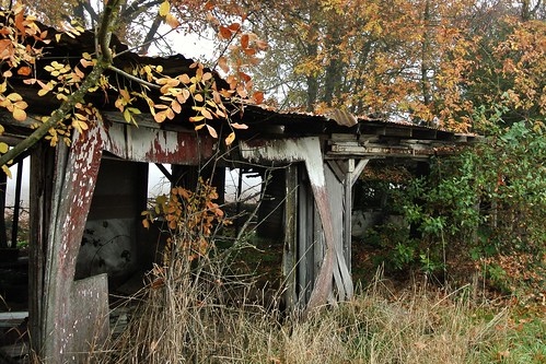
Our first stop was at Red Ridge Farms, but on the way there I noticed this scene by the side of the road.   I thought it looked like the bad part of town in The Shire.


Camera Roll-741
Next to this was a foggy, abstract scene that looked like another world.


Camera Roll-850
Up on the hill at Red Ridge Farms, it was still pretty foggy.  We looked around the shop and looked at plants.


Camera Roll-803
In a little while, there were moments when the sun would partly break through the fog.  The hill was covered with leaves.


Camera Roll-819
We went over to the Durant Vineyards tasting room next door.  I walked out on their deck and took this photo of the vines with the fog in the background.


Camera Roll-852
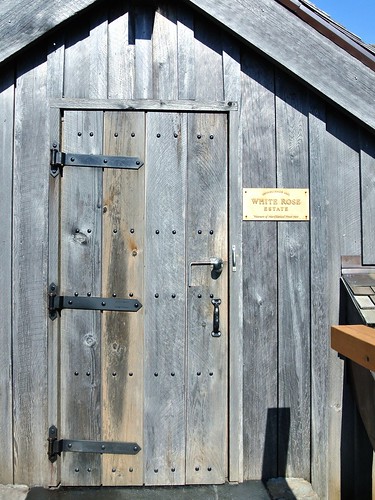
Then we went up to White Rose Estate, where we tasted some Pinot Noir, learned about the history of the area, and enjoyed the spectacular view shown in the first photo.

On the way back towards town, we stopped at the Maresh Red Barn tasting room.  I wanted to try some Riesling, and they didn't have any, but advised us to go to Crumbled Rock Winery just down the road. They did have the Riesling I was looking for.

Winemaking-1495

At Crumbled Rock, we also got to watch someone get inside one of the large vats and shovel the grapes out of the bottom.

We finished the trip with a great meal at Paulee Restaurant, then headed back home.

I always enjoy exploring the Dundee Hills area, and I discover something new every time I go there.
 

Thursday, April 18, 2013

Cosplay modeling tips: where to look

After a recent cosplay photo shoot, I was chatting with friends about cosplay photography and cosplay modeling.  One of my friends suggested that I write up some of these ideas, and so this will be the first of a series of posts about cosplay modeling.

As a photographer, a common question I get from cosplay models is "Where should I look?"

Your first decision will be whether to look into the camera with your eyes or not.

When you look directly at the camera with your eyes, then in terms of the final photo, you are engaging with the viewer of the image (not the camera).

Some questions to consider: Who do you imagine that person is?  What will you communicate to them?

If you are cosplaying a character who is part of a story, you can imagine that you are looking at one of the other characters from the story, within a situation that would make sense in the story. This creates a context and meaning for your expression.

For example, if you become character A, about to confess your love for character B, this will look much more interesting than if you blankly stare into the camera with no meaning to your expression.

[This will be an ongoing theme in these articles.  Instead of asking "What should I do?" a better question is "What is my character doing here and why?"  Actions that have no meaning or purpose will look fake in a photo.  Sometimes there are technical reasons for adjusting positions that do not really have any intrinsic meaning in terms of the story of the scene, such as positioning based on where the lights are.  Even in cases like this, it helps to imagine there's a purpose within the story.]

Of course, you shouldn't look directly at the camera in every shot, because that becomes repetitive and boring.

When looking off-camera with your eyes, continue to imagine what it is your character is doing. Who or what are you looking at, and why?

One common problem when looking off-camera is turning your eyes too far. In everyday life, when you look off to the side, it's natural to turn your head part way towards the target, then turn your eyes the rest of the way until you can easily focus on the target.  You do this because it's the natural, least-effort way to look to the side.

But in a photo, this usually produces an unflattering look.  If you turn your head 45 degrees to the right of the camera, then turn your eyes another 45 degrees to the right, it creates a situation where the camera sees mostly the whites of your eyes.  This can create an odd zombie-like look -- which may work great when cosplaying a zombie or monster, but usually not in other cases.

Instead, it is usually better to turn your head father off-camera than your eyes are turned.

Or to put it another way, if you turn your head 45 degrees right, then turn your eyes back to the left 20 degrees or so.  This presents more of your iris to the camera, which will look nicer.
 It may feel unnatural to do this, but the action makes sense if you imagine that you've finished looking at the thing really far to the side, and have started to look back the other way.

Now let's consider head position.

Cosplayers often wear wigs, and the wigs usually project out from the forehead and temple area more than real hair would. 

If the primary light source is coming from above (which is very common), this can create a visual problem, where the wig casts an unattractive shadow on the face, causing a dark-circles-under-the-eyes look, combined with relatively brighter spots on the nose and cheekbones. 

In this situation, you'd be better off tilting your head slightly upward.  It doesn't have to be a huge exaggerated upward tilt.  Normally a slight tilt up is enough to eliminate the undesirable wig shadow.

If the photographer is controlling the lights, then don't worry about this -- it's the photographer's job to position the lights to avoid unwanted shadows.  But if it's a photo shoot with natural light, or artificial lights that you can't control, this can often come into play.

One thing to avoid in general is pulling your head back towards your shoulders.  This can create an awkward, frightened look (think "turtle retreating into the shell"), and can also create unflattering shadows under your chin.  Usually it is better to push your forehead forward, which looks more confident.  It can work to first push your shoulders very slightly forward, and then push your forehead forward beyond your shoulders.

I hope this information has been helpful.  Stay tuned for the next article, which will tackle the eternal question: "What should I do with my hands?"

Tuesday, March 05, 2013

Happiness

"... the 'pursuit of happiness' is not equivalent to the 'avoidance of unhappiness.'"  -- Nassim Taleb, Antifragile.

I read this quote today, and I was struck by how simple this idea is, yet how easy it is to lose sight of it.  Sometimes we act as though we believe that happiness will result once we can somehow eliminate every possible reason for unhappiness.

There are several problems with this.  First, it isn't really possible to remove every possible justification for unhappiness, so the desire to do so sets up an impossible ideal that we can never meet.  Second, the mere absence of unhappiness would only create a neutral state, not happiness.  Finally, by observing happy people, we see that they did not eliminate every possible problem from their lives, rather they are happy even though there are still many imperfections in life.  They just care more about the good things than the bad.

I'm reminded of an experience I had many years ago when I was wandering around in a small town in Costa Rica.  I saw a man who was standing behind a little table where he was selling some crafts.  He saw me walking by, and he struck up a conversation.  He obviously really wanted to tell me something, but even though we both spoke English, at first we had a bit of trouble understanding each other's accents.  He spoke with a strong Jamaican accent, and I have a west-coast U.S. accent.  And I was also suspicious at first that he was trying to give me some sort of sales pitch so I would buy what he was selling, but actually that wasn't the point he was trying to make.

He pointed to the table, and pressed down on it, and the legs wobbled.   He said, "You see how bad this table is?"  (I thought: you're right, it looks like it is about to fall apart.)  He said, "I could say, oh no, this is no good, I need a new table.  But really, this is OK, a different table wouldn't change anything.  It's a good day, we can be happy just like this."

That was over 15 years ago, but I still think about it.  Would a better table change anything?

Saturday, March 02, 2013

Better Homes and Pixels

As I explore the world of LINE Play, I enjoy seeing my friends' virtual homes and noticing how their creations reflect their personalities.  And who could resist the chance to step into the houses of random strangers and take a look around without fear of arrest?  Yes, the "Random" button provides a tempting gateway into the glory and the madness of LINE Play.

One of my first random journeys took me into a pretty over-the-top house:

I sense a real dedication to collecting here, but there isn't a lot of room to move around in this house.  There's really two or three houses worth of stuff here competing for attention.  This lineplayer needs a storage unit or two.

Now let's look at an example of a balanced design:

This charming house uses a well-realized nature theme, and also provides plenty of open space.  I love the couch and table area.  The record player and tea set suggest a cozy afternoon in the country, and the leaf-patterned rug brings it all together as a special space.  

Gothic themes are pretty common in lineplay, but I especially liked the one below:

This person used colored tiles to make a custom design.  There seems to be a flaming pentagram in front of the wine cabinet.  Let's hope the wines stay properly chilled.  And is the black coffin a refrigerator?  This may not be the most practical house, but it would be a fun party space.


The guy above seems to like to take photos of his bathtub, while relaxing with a glass of wine.  Like many lineplay houses, it makes me wonder what goes on there.

I was stunned to see this amazing rock 'n' roll house by a lineplayer whose diary says she is in a band in real life.  Half the house is a perfect club/bar area.

This issue's award for the most romantic house goes to the one pictured above.  The grand piano near the tub is a beautiful touch.  This house makes me imagine a luxurious lifestyle filled with amazing music, food, and drinks.

Sometimes I can't tell what's going on in lineplay.  Why is this girl blue?  Is it a makeup trend?

This "Choco Cafe House" impressed me the moment I walked in.  The theme is fully realized in every part of the house.  It made me hungry to walk around in here.

Finally, after exploring random places, I usually stop by a friend's house to see how they're doing.  Here I am visiting the friend who originally introduced me to LINE Play.  Her house is cute!

That's all for this installment of Better Homes and Pixels.   Have you found any especially interesting LINE Play houses?  Please share your discoveries.