A very common question from cosplay models is "What should I do with my hands?"
Well, whenever we look at a scene with a person in it, our attention is naturally drawn to their face and their hands, because these are usually the best clues to what is happening. So for the viewer, the face and hands occupy much more "mental space" in the photo than their actual physical size. And hands are big -- they are bigger than your ears, bigger than your nose -- we don't usually think of them as large, but they are. If you combine all that with a pose where the hands are closer to the camera than anything else, all of a sudden the hands seem huge!
So the rule is simple: your hands must either tell the story, or get out of the way and be less noticeable.
Examples of your hands telling the story would be things like: throwing a punch, reaching out for the hand of a friend, casting a spell, lifting a drink to make a toast, making a gesture of prayer, picking someone's pocket, etc.
But if your hands aren't going to tell the story, then you want to make them less noticeable, by doing things like: moving them farther from the camera, turning them edgewise to the camera, putting them behind something, putting them under something, etc.
It's really that simple. I was originally going to explain this in a more complicated way, but I realized that it all boils down to this.
Hands must tell the story, or get out of the way.
That is the main thing you need to know about hands.
Monday, April 21, 2014
Saturday, April 12, 2014
The Expense Paradox
In the business world, these two scenarios occur regularly:
Employee: "Last quarter we increased spending on X by $1 million, and revenue increased by $2 million. Thanks to that wise decision we're ahead by $1 million! Hooray! I'm the king of the world!"
Boss: "Wait just a second, con artist, I see what you're doing there! Correlation is not causation. In order to reach a conclusion, we'd have to know what would have happened in an alternate universe where spending stayed the same. Maybe revenue increased for some other reason, and the spending increase didn't help at all. Sorry, we can't assume that the spending increase was beneficial."
Employee: "Last quarter we cut expenses on X by $1 million. This is great news, right?"
Boss: "Well of course, cutting expenses goes straight to the bottom line. Thanks to that wise decision, we're ahead by $1 million. Hooray! You're the king of the world!"
Amazingly, people can convince themselves that both A and B sound reasonable, even though they contradict each other. A assumes that the relationship between spending and overall results obviously cannot be known, whereas B assumes that reducing spending is obviously beneficial. Most people have no problem believing in both of these ideas, as long as they do not have to assert both in the same meeting. (And of course, sometimes people actually do assert both in the same meeting, without noticing the contradiction.)
Why is this?
Both scenarios have at least one implied counterfactual conditional. In A, it is "If we had not spent the extra $1 million, revenue would still have increased." In B -- though it is not stated, because the boss failed to make this argument -- it is "If we had not cut spending by $1 million, revenue would have increased by more than $1 million."
There are many different categories of these statements, and they do not seem equally natural. Let's explore a few (but not all) of the possible categories.
Category 1 (disappointment / whining): "If [something bad] hadn't happened, then [something good] would have happened."
Category 6 (reverse sour grapes / dreamy optimism): "If [something bad] had happened, then [something good] would have happened."
Scenario A:
Boss: "Wait just a second, con artist, I see what you're doing there! Correlation is not causation. In order to reach a conclusion, we'd have to know what would have happened in an alternate universe where spending stayed the same. Maybe revenue increased for some other reason, and the spending increase didn't help at all. Sorry, we can't assume that the spending increase was beneficial."
Scenario B:
Employee: "Last quarter we cut expenses on X by $1 million. This is great news, right?"
Boss: "Well of course, cutting expenses goes straight to the bottom line. Thanks to that wise decision, we're ahead by $1 million. Hooray! You're the king of the world!"
Amazingly, people can convince themselves that both A and B sound reasonable, even though they contradict each other. A assumes that the relationship between spending and overall results obviously cannot be known, whereas B assumes that reducing spending is obviously beneficial. Most people have no problem believing in both of these ideas, as long as they do not have to assert both in the same meeting. (And of course, sometimes people actually do assert both in the same meeting, without noticing the contradiction.)
Why is this?
Both scenarios have at least one implied counterfactual conditional. In A, it is "If we had not spent the extra $1 million, revenue would still have increased." In B -- though it is not stated, because the boss failed to make this argument -- it is "If we had not cut spending by $1 million, revenue would have increased by more than $1 million."
There are many different categories of these statements, and they do not seem equally natural. Let's explore a few (but not all) of the possible categories.
Category 1 (disappointment / whining): "If [something bad] hadn't happened, then [something good] would have happened."
- "If I hadn't gotten stuck in traffic, I would have given a better presentation and gotten a raise."
- "If I hadn't made that stupid remark, I would have been popular."
Category 2 (relief / gratitude): "If [something good] hadn't happened, then [something bad] would have happened."
- "If my commute hadn't gone so easily, I might have blown my presentation and not gotten that raise."
- "If I hadn't made those brilliant remarks, I might not have become popular."
Categories 1 and 2 sound natural. They are the type of remarks we typically hear a lot.
Category 3 (first world problems / greed): is "If [something good] hadn't happened, then [something even better] would have."
- "If I hadn't found a dollar bill lying on the sidewalk, I would have found a five dollar bill instead."
- "If I hadn't been offered a great job, I would have gotten an even better job somewhere else."
Category 4 (silver lining): "If [something bad] hadn't happened, then [something worse] would have happened."
- "If I hadn't gotten stuck in traffic, I would have driven too fast and gotten into an accident."
- "If I hadn't gotten sick and canceled my vacation, I would have caught an even worse disease overseas."
Categories 3 and 4 do not seem very natural. The statements sound a bit like jokes, and most people do not make statements like this very often.
Category 5 (sour grapes): "If [something good] had happened, then [something bad] would have happened."
- "If I had been able to afford that house with the swimming pool, I would have drowned."
- "If I had been more successful in school, I wouldn't have discovered all my non-academic talents."
Category 6 (reverse sour grapes / dreamy optimism): "If [something bad] had happened, then [something good] would have happened."
- "If I had gotten lost on the way to work, I would have met an interesting person and made friends."
- "If my car had been stolen, I would be healthier now from all the walking."
Category 5 is familiar since it is the "sour grapes" mode of thinking, but it may not be convincing. Category 6 ("reverse sour grapes") sounds strange, perhaps like a delusional wish-fulfillment fantasy.
To recap: 1 and 2 sound familiar, 5 is sour grapes, and 3, 4, and 6 sound strange.
Now let's revisit scenarios A and B. The boss's counter-argument in A uses Category 1 thinking: "If you hadn't spent an extra $1 million [something bad], revenue would have still increased [something good]." Since Category 1 seems familiar, this type of reply comes to mind easily.
But in order to make a counter-argument in scenario B, the boss would need to use Category 3 thinking: "If you hadn't cut expenses by $1 million [something good], then revenue would have increased by more than $1 million [something better]."
This is why the same person can "agree" with the boss in both A and B, even though the scenarios directly contradict each other. The boss's counter-argument in A comes to mind easily because it is in Category 1. The counter-argument the boss fails to make in B does not come to mind easily because it is in Category 3, so people do not tend to notice that it is missing.
Also, scenario A simply requires less mental effort from the boss. The boss, who dislikes expense increases, can easily imagine a world where the expense increases did not cause the actual good outcome.
But to make a counter-argument in scenario B (and thus treat it the same way as A), the boss, who likes expense reductions, would have to make two mental leaps that both involve more effort: first, imagining a world where the outcome was better than it actually was, and then imagining that the supposedly "good" action of expense reductions prevented the better outcome that did not occur. This kind of thinking is much more complicated.
That's how we wind up with a situation where people can act as if the effect of expenses on results is both completely predictable and also unknowable.
Saturday, February 15, 2014
Setting up the Fitbit Aria with Comcast / Xfinity
I got the FitBit Aria and had some trouble setting it up with my WiFi network. At first I was getting the "WIFI ERR" message from the scale. It turns out that if you have a relatively new cable box / wireless router from Comcast / Xfinity, it does not enable 802.11b by default. The way to fix this is explained here:
http://customer.comcast.com/help-and-support/internet/about-the-wireless-gateway/
After I made the changes to the router configuration, the FitBit Aria worked.
I wasted a lot of time wondering why it was trying to connect to my neighbor's WiFi instead of mine. It was just because of 802.11b needing to be enabled.
Monday, October 21, 2013
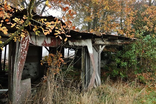
Dundee Hills

Yesterday we went out to the Dundee Hills, one of my favorite Oregon wine-growing regions. The valley was full of fog, as seen in the background of this photo, but up in the hills it was sunny, and Mt. Hood was visible in the distance. This is the view from White Rose Estate.
Our first stop was at Red Ridge Farms, but on the way there I noticed this scene by the side of the road. I thought it looked like the bad part of town in The Shire.

Next to this was a foggy, abstract scene that looked like another world.
Up on the hill at Red Ridge Farms, it was still pretty foggy. We looked around the shop and looked at plants.

In a little while, there were moments when the sun would partly break through the fog. The hill was covered with leaves.

We went over to the Durant Vineyards tasting room next door. I walked out on their deck and took this photo of the vines with the fog in the background.
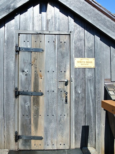
Then we went up to White Rose Estate, where we tasted some Pinot Noir, learned about the history of the area, and enjoyed the spectacular view shown in the first photo.
On the way back towards town, we stopped at the Maresh Red Barn tasting room. I wanted to try some Riesling, and they didn't have any, but advised us to go to Crumbled Rock Winery just down the road. They did have the Riesling I was looking for.

At Crumbled Rock, we also got to watch someone get inside one of the large vats and shovel the grapes out of the bottom.
We finished the trip with a great meal at Paulee Restaurant, then headed back home.
I always enjoy exploring the Dundee Hills area, and I discover something new every time I go there.
Thursday, April 18, 2013
Cosplay modeling tips: where to look
After a recent cosplay photo shoot, I was chatting with friends about cosplay photography and cosplay modeling. One of my friends suggested that I write up some of these ideas, and so this will be the first of a series of posts about cosplay modeling.
As a photographer, a common question I get from cosplay models is "Where should I look?"
Your first decision will be whether to look into the camera with your eyes or not.
When you look directly at the camera with your eyes, then in terms of the final photo, you are engaging with the viewer of the image (not the camera).
Some questions to consider: Who do you imagine that person is? What will you communicate to them?
If you are cosplaying a character who is part of a story, you can imagine that you are looking at one of the other characters from the story, within a situation that would make sense in the story. This creates a context and meaning for your expression.
For example, if you become character A, about to confess your love for character B, this will look much more interesting than if you blankly stare into the camera with no meaning to your expression.
[This will be an ongoing theme in these articles. Instead of asking "What should I do?" a better question is "What is my character doing here and why?" Actions that have no meaning or purpose will look fake in a photo. Sometimes there are technical reasons for adjusting positions that do not really have any intrinsic meaning in terms of the story of the scene, such as positioning based on where the lights are. Even in cases like this, it helps to imagine there's a purpose within the story.]
Of course, you shouldn't look directly at the camera in every shot, because that becomes repetitive and boring.
When looking off-camera with your eyes, continue to imagine what it is your character is doing. Who or what are you looking at, and why?
One common problem when looking off-camera is turning your eyes too far. In everyday life, when you look off to the side, it's natural to turn your head part way towards the target, then turn your eyes the rest of the way until you can easily focus on the target. You do this because it's the natural, least-effort way to look to the side.
But in a photo, this usually produces an unflattering look. If you turn your head 45 degrees to the right of the camera, then turn your eyes another 45 degrees to the right, it creates a situation where the camera sees mostly the whites of your eyes. This can create an odd zombie-like look -- which may work great when cosplaying a zombie or monster, but usually not in other cases.
Instead, it is usually better to turn your head father off-camera than your eyes are turned.
Or to put it another way, if you turn your head 45 degrees right, then turn your eyes back to the left 20 degrees or so. This presents more of your iris to the camera, which will look nicer.
It may feel unnatural to do this, but the action makes sense if you imagine that you've finished looking at the thing really far to the side, and have started to look back the other way.
Now let's consider head position.
Cosplayers often wear wigs, and the wigs usually project out from the forehead and temple area more than real hair would.
If the primary light source is coming from above (which is very common), this can create a visual problem, where the wig casts an unattractive shadow on the face, causing a dark-circles-under-the-eyes look, combined with relatively brighter spots on the nose and cheekbones.
In this situation, you'd be better off tilting your head slightly upward. It doesn't have to be a huge exaggerated upward tilt. Normally a slight tilt up is enough to eliminate the undesirable wig shadow.
If the photographer is controlling the lights, then don't worry about this -- it's the photographer's job to position the lights to avoid unwanted shadows. But if it's a photo shoot with natural light, or artificial lights that you can't control, this can often come into play.
One thing to avoid in general is pulling your head back towards your shoulders. This can create an awkward, frightened look (think "turtle retreating into the shell"), and can also create unflattering shadows under your chin. Usually it is better to push your forehead forward, which looks more confident. It can work to first push your shoulders very slightly forward, and then push your forehead forward beyond your shoulders.
I hope this information has been helpful. Stay tuned for the next article, which will tackle the eternal question: "What should I do with my hands?"
Tuesday, March 05, 2013
Happiness
"... the 'pursuit of happiness' is not equivalent to the 'avoidance of unhappiness.'" -- Nassim Taleb, Antifragile.
I read this quote today, and I was struck by how simple this idea is, yet how easy it is to lose sight of it. Sometimes we act as though we believe that happiness will result once we can somehow eliminate every possible reason for unhappiness.
There are several problems with this. First, it isn't really possible to remove every possible justification for unhappiness, so the desire to do so sets up an impossible ideal that we can never meet. Second, the mere absence of unhappiness would only create a neutral state, not happiness. Finally, by observing happy people, we see that they did not eliminate every possible problem from their lives, rather they are happy even though there are still many imperfections in life. They just care more about the good things than the bad.
I'm reminded of an experience I had many years ago when I was wandering around in a small town in Costa Rica. I saw a man who was standing behind a little table where he was selling some crafts. He saw me walking by, and he struck up a conversation. He obviously really wanted to tell me something, but even though we both spoke English, at first we had a bit of trouble understanding each other's accents. He spoke with a strong Jamaican accent, and I have a west-coast U.S. accent. And I was also suspicious at first that he was trying to give me some sort of sales pitch so I would buy what he was selling, but actually that wasn't the point he was trying to make.
He pointed to the table, and pressed down on it, and the legs wobbled. He said, "You see how bad this table is?" (I thought: you're right, it looks like it is about to fall apart.) He said, "I could say, oh no, this is no good, I need a new table. But really, this is OK, a different table wouldn't change anything. It's a good day, we can be happy just like this."
That was over 15 years ago, but I still think about it. Would a better table change anything?
Saturday, March 02, 2013
Better Homes and Pixels
As I explore the world of LINE Play, I enjoy seeing my friends' virtual homes and noticing how their creations reflect their personalities. And who could resist the chance to step into the houses of random strangers and take a look around without fear of arrest? Yes, the "Random" button provides a tempting gateway into the glory and the madness of LINE Play.
One of my first random journeys took me into a pretty over-the-top house:
 I sense a real dedication to collecting here, but there isn't a lot of room to move around in this house. There's really two or three houses worth of stuff here competing for attention. This lineplayer needs a storage unit or two.
Now let's look at an example of a balanced design:
 This charming house uses a well-realized nature theme, and also provides plenty of open space. I love the couch and table area. The record player and tea set suggest a cozy afternoon in the country, and the leaf-patterned rug brings it all together as a special space.
Gothic themes are pretty common in lineplay, but I especially liked the one below:
 This person used colored tiles to make a custom design. There seems to be a flaming pentagram in front of the wine cabinet. Let's hope the wines stay properly chilled. And is the black coffin a refrigerator? This may not be the most practical house, but it would be a fun party space.

The guy above seems to like to take photos of his bathtub, while relaxing with a glass of wine. Like many lineplay houses, it makes me wonder what goes on there.
 I was stunned to see this amazing rock 'n' roll house by a lineplayer whose diary says she is in a band in real life. Half the house is a perfect club/bar area.
 This issue's award for the most romantic house goes to the one pictured above. The grand piano near the tub is a beautiful touch. This house makes me imagine a luxurious lifestyle filled with amazing music, food, and drinks.
 Sometimes I can't tell what's going on in lineplay. Why is this girl blue? Is it a makeup trend?
 This "Choco Cafe House" impressed me the moment I walked in. The theme is fully realized in every part of the house. It made me hungry to walk around in here.
 Finally, after exploring random places, I usually stop by a friend's house to see how they're doing. Here I am visiting the friend who originally introduced me to LINE Play. Her house is cute!
That's all for this installment of Better Homes and Pixels. Have you found any especially interesting LINE Play houses? Please share your discoveries.
One of my first random journeys took me into a pretty over-the-top house:

Now let's look at an example of a balanced design:

Gothic themes are pretty common in lineplay, but I especially liked the one below:


The guy above seems to like to take photos of his bathtub, while relaxing with a glass of wine. Like many lineplay houses, it makes me wonder what goes on there.


That's all for this installment of Better Homes and Pixels. Have you found any especially interesting LINE Play houses? Please share your discoveries.
Saturday, November 24, 2012
Crane Fashion

Northwest Portland is a great place to spot examples of cutting-edge crane fashion. Carefully coordinating the crane's colors with the building colors produces a sophisticated, elegant look (above). It's worth taking the time to find the best looking crane. A mismatched, clashing crane would look sloppy, and may even create the impression that you only have one crane.

A bold contrasting crane color can also work (above). Notice how the yellow logo on the blue body serves as an accent color to link the crane with the building, and the horizontal position of the crane keeps it from competing with the background.
Well, that's all for this look at crane fashion. I'll be out looking for more examples to show you.
Saturday, January 21, 2012
Saturday photos

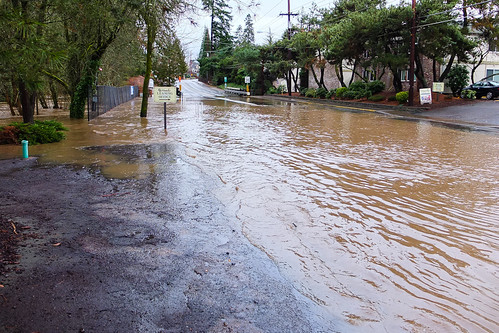
Today I went out to the St. Johns area, I wanted to look at the water level in the Willamette river, since we've had so much rain and flooding lately, and I thought I'd take some photos with the Fuji X10. The photo above was my favorite of the day.
While I was at Cathedral Park under the St. Johns bridge, I noticed quite a few other photographers there taking photos of the bridge. I guess it is a pretty common subject, in fact, I've seen a lot of photos that look like sort of like the one above. This spot kind of jumps out as an obvious place to stop and take a picture, because it is right on the main path through the park.
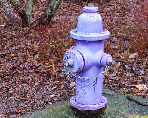
I also saw a bright purple fire hydrant. I wonder who picked this color.
Down at the river, the water level was high, and the water was very muddy. It rained most of the time while I was walking around. While I was right here I met two women who were out for a walk, and they asked me if I remember the flood back in 1996. I did, and we talked about that for a while.

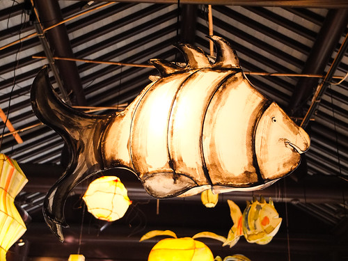
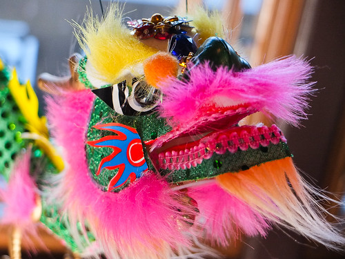
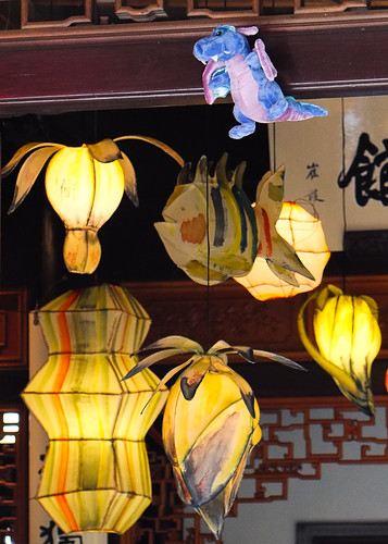
Then I went to the Chinese Garden. They had decorated it with lanterns to get ready for their celebration of the Chinese New Year.


I also encountered some fish and some dragons.


Even though it was rainy, it was fun to get out of the house and have some quiet time.
Thursday, January 19, 2012
Fanno Creek flooding
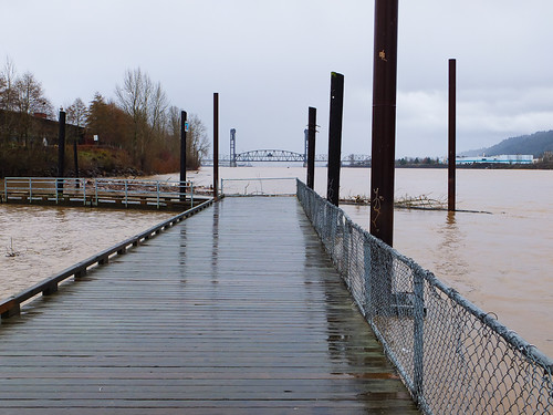
Fanno Creek flooding today at SW Oleson Road, Portland, Oregon.
The water swept across the road and appeared to be at least 6" deep in places.
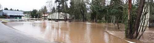
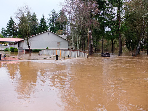
The water went over the bridge here
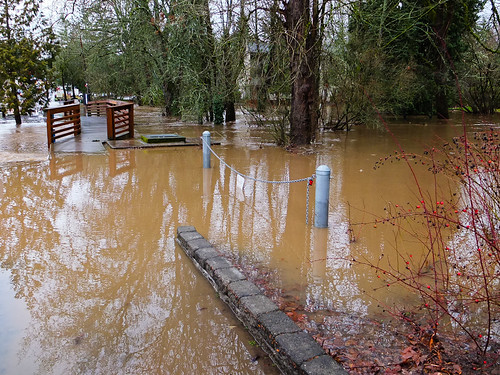
The pedestrian bridge is level with the water
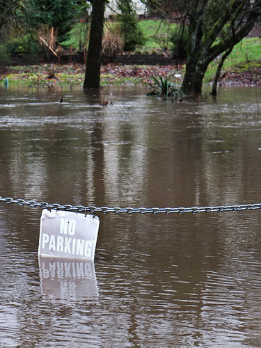
Oh, but that would have been a perfect parking place!
The water swept across the road and appeared to be at least 6" deep in places.
The water went over the bridge here
The pedestrian bridge is level with the water
Oh, but that would have been a perfect parking place!
Sunday, September 11, 2011
Saturday, September 10, 2011
How to make improvised iPhone tripods
If you use your iPhone to take photos, you may have an app such as Camera+ that allows you to take a photo on a timer. Sounds good, this could be useful for a self portrait or a group picture with yourself in it. But how are you going to prop up the iPhone to take the picture? There are iPhone specific mini tripods, but I'm going to show you how to make improvised iPhone camera tripods out of everyday things. (Actually these aren't literally "tripods," but they are ways to stabilize the iPhone in the right orientation for taking a hands-free photo)
The first method is to take a small glass with sloping sides, and a stack of Post-its, then split the stack of Post-its in half and put the iphone in the glass between them, like this:


If you want to turn the iPhone sideways to take a landscape-orientation picture or video, that works too, but it is a little trickier to get the Post-its arranged just right:


The second method works if you have a flip case for your iPhone. I have one from Belkin that looks like this:

Take the iPhone out of the case, then stand the iPhone up in the part of the case where the screen normally is, like this:
 Now you can take a timer photo in the vertical orientation.
The third method is to get one of those cardboard insulating sleeves from Starbucks that makes it more comfortable to hold the hot coffee cup. This works best when the sleeve is brand new and the cardboard is still stiff. Stand the iPhone up in the coffee sleeve and take a timer photo:


I hope these tricks are useful to other iPhone photographers out there.
The first method is to take a small glass with sloping sides, and a stack of Post-its, then split the stack of Post-its in half and put the iphone in the glass between them, like this:


If you want to turn the iPhone sideways to take a landscape-orientation picture or video, that works too, but it is a little trickier to get the Post-its arranged just right:


You want the sticky part of the post it pressed against the back of the iPhone.

Take the iPhone out of the case, then stand the iPhone up in the part of the case where the screen normally is, like this:

The third method is to get one of those cardboard insulating sleeves from Starbucks that makes it more comfortable to hold the hot coffee cup. This works best when the sleeve is brand new and the cardboard is still stiff. Stand the iPhone up in the coffee sleeve and take a timer photo:

Finally, if you have the Belkin flip case and the coffee sleeve, you can stand the flip case in the sleeve, turn the iPhone sideways, and put it into the top of the case like this:

Wednesday, August 17, 2011
My favorite photography iPhone and iPad apps
My favorite and most-used photography apps for the iPhone and iPad are:
- FlickStackr - if you use Flickr this is a great mobile interface to it
- Camera+ - great for taking photos from the iPhone, then processing them
- Photogene for iPad - together with the camera connection kit, I can transfer photos (even RAW files) from my camera to the iPad, edit them on the iPad, and then upload them.
- The Photographer's Ephemeris - pick a place on earth and a date and calculate the time and angle of sunrise, sunset, moonrise, and moonset. Great for planning outdoor photos.
- iDoF Calc - calculates depth of field
- LightStudio - useful for pre-visualizing how different lighting schemes will look
- Strobox - only useful if you do complicated lighting with multiple lights, but great for easily creating diagrams of that to refer back to later
- Advanced Photoshop magazine for iPad - learn more about Photoshop
Wednesday, August 03, 2011
What would a giant do?
When I first got my iPad I thought of it as a kind of giant iPhone. Over time my mind has reversed this, and I now think of the iPhone as a tiny iPad, with a screen too small to make movies and comics look their best, too small to easily type on, and too small to use for drawing. The iPhone really only has one main advantage over the iPad: it fits in my pocket.
But what if I were a giant? Then I'd have really huge pockets, the iPad would fit in them, and I wouldn't need both an iPhone and an iPad. Brilliant! I love creative solutions like that. All I have to do in order to maximize my gadget efficiency is to become a giant.
And that proves that for any problem, if you just think outside the box a little, you can come up with a clear and simple solution that is completely impossible and useless.
Tuesday, July 26, 2011
Vancouver, B.C. Panorama (Gigapan)
I took the photos for this panorama while bicycling around Stanley Park, Vancouver, B.C.
Sunday, June 26, 2011
The Problem
"The core problem with Teen Titans is that it’s never been about teenagers, but rather what adult writers want teenagers to be. Superboy, Robin, Wonder Girl, Kid Flash – these kids revere their elders and try to emulate them. Fuck that noise. Adults don’t deserve reverence. Plus, teenagers don’t want to read about obedient, law-abiding teens, and adults reliving their youth don’t want to read about obedient, law-abiding teens. They both want sex, drugs, and rock n’ roll (or substitute in hip hop). The Titans shouldn’t be fighting crime, they should be fighting for the right to party, and generally reminding adults how much they suck."
-- The Hooded Utilitarian
-- The Hooded Utilitarian
Friday, June 03, 2011
Making the Final Battle photo
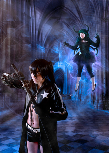
This was a cosplay photo based on the anime Black Rock Shooter.
For this photo I planned a lot out in advance. I asked the models to send me some example photos of the costumes so I could start thinking about what I wanted to do before the shoot. I realized that there wasn't any location available that would be right, so I planned from the start to do this as a composite photo, and we shot these indoors against a plain white background.
Kori was cosplaying as Dark Master (upper right), and I had her do some shots where she jumped up in the air and turned 180 degrees, then landed facing the opposite direction. With jumping shots, if I don't want it to look like jumping I'll often do something like this, or have the person jump sideways or backwards. Doing that takes away a lot of the characteristic body language of jumping and makes the pose a little harder to figure out.
So this was Kori's shot:


As soon as I saw this, I knew I could base a whole scene around this pose, because it looks like she is levitating, the pointed toes are great, and she has a wonderfully intense facial expression.
The shot of Emily as Black Rock Shooter that I ultimately used was this one:


I love her facial expression here, it is perfect for the character and the scene. She looks like she is completely ready to fight, but wishes she didn't have to.
Prior to the shoot I had done some research to try to find background photos. If I'd had access to a suitable location I would have tried to take a background photo myself, but I couldn't find anything like this. So I searched for Creative Commons photos of a cathedral, and I was especially looking for one that would have the black and white checkerboard pattern that is a visual motif in Black Rock Shooter. I found a great photo taken by Kent Landerholm. The original photo is this:
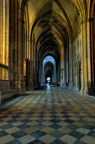
This is a wonderful HDR photo and it was just what I was looking for.
After the shoot, I started to think about how to lay out the composition. Here is one of my rough sketches for it:

You can see from this sketch that I'm still not sure what to do at this point. I'm trying out various positions. The circles and lines are a way of thinking about how the lighting might look, but I wound up doing something very different. The note "7 or 8" in this sketch was me trying to decide which photo of Emily to use.
I decided to mirror-image Kori and make a diagonal from lower left to upper right instead, because this sketch didn't feel right. But it helped me decide on a composition before I wasted a lot of time in Photoshop.
Once I decided on the layout, I put the elements together into a scene, and added in a "special effects" fractal that I had made in Oxidizer. I wanted the fractal image to be very high resolution, to actually be larger than the scene, so this took something like 2 hours to render on my laptop.
When I first put the elements into one image, that is when I had to make a decision whether to go ahead or bail out, because at this stage of the project it always looks pretty bad, nothing is blended yet, the colors are wrong, so I had to see some potential in it. In this case I thought I was on the right track.
The background photo is very wide-angle, with some spatial distortion because of that. Instead of trying to hide that, I actually increased it slightly by warping the background to make it "spill out" slightly more to the lower left. The Kori and Emily photos are taken from 2 different angles, so when put together they do kind of match the wide angle perspective of the background.
The colors in the original background photo are very yellow, and at first I tried to work with that, but it didn't work. My next approach was to desaturate the background to make it almost black-and-white, but that didn't feel right either. I decided on blue and purple for the main colors.
A lot of the work after that was painting in the new colors and the new lighting. I didn't use any Photoshop "Render Lighting" stuff here, it was all by hand. I also painted in some manga-style "speed lines" and added some "atmospheric heat distortion" to the area around Kori. I originally planned to do that with the ripple filter, but it didn't look right, so I ended up using the Liquify tool instead and putting in the distortion by hand.
When I got that figured out, I still felt it looked too "plastic." I decided to make it look like there was dust in the air, like in a very old building. So I started painting in "dust" layers, and this made it look a lot more like what I wanted.
One of my friends gave me a helpful critique of the rough draft of this piece, and based on his advice I added a bit of "distance blur" and increased the light and effects at the upper right to balance out the light at the lower left.
And that's about it. It was a lot of work, but in the end I got a scene that matched what I had imagined. All of this was inspired by the models Kori and Emily, I put in a lot of time on this because they gave me such great material to work with.
Subscribe to:
Posts (Atom)